Have you ever looked at an Instagram page and thought about how beautifully curated it looks? Color can be a powerful tool to create visual harmony and convey messages without words. Colors can soothe your frazzled nerves. They define a person’s mood and can define a specific aura and energy.
The first step to creating an Instagram profile with a color theme is to figure out your profile’s current color palette. So how do you find your Instagram’s color palette?
You can use multiple apps and websites, such as ColorKuler or MyInstaPalette, to find the color palette of your current Instagram profile. After creating an account and entering your Instagram username, these platforms will show you your profile’s color palette.
Once you figure out your Instagram color palette, you are just a few steps away from curating your palette with the colors you want to be associated with your account.
How to Find Out Your Instagram Color Palette?
Color can be an essential tool in your Instagram profile to create a persona and attract new followers. It gives your brand identity and consistency. To make the audience focus more on the overarching theme of your page, you need first to find out the color palette your Instagram profile is using.
There are multiple apps and websites that help you learn about your profile’s color palette. Here are the steps required for using ColorKuler:
- Open the ColorKuler website.

- Use the Free option to get a palette of your last nine photos or Pro to get in-depth analysis.

- After your account is created, link your Instagram account, and you will be immediately given your Instagram palette.

- Make the best use of your results!
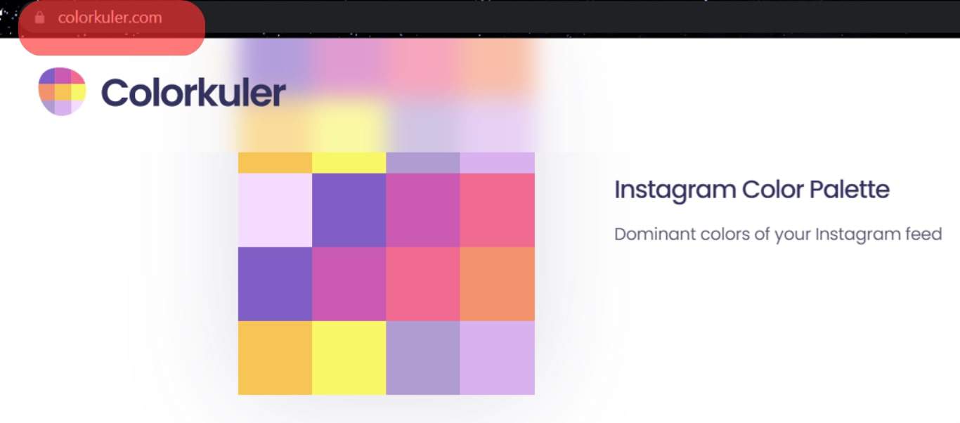
ColorKuler gives you information about the dominant colors of your Instagram feed and your profile color.
Why Use ColorKuler?
This website offers an excellent tool for anyone on Instagram looking to create a brand. Using color to navigate your brand image is a brilliant marketing tactic, especially for an image-centred app like Instagram that primarily focuses on visuals.
You can have a more precise and thorough understanding of what colors you want to incorporate into your pictures to create a more cohesive Instagram profile for your brand.
You can also use ColorKuler to analyze the palettes of accounts you love, discover their patterns and what sets them apart from others, and use the inspiration to set up your own color palette.
Another instance where the features of ColorKuler could benefit you is if you are working in fashion. This tool will make it easy to sample colors from many fashion blogs and boutiques and provide information on which color palettes are famous to the target audience.
You could even compare and contrast your color palette with that of other businesses or rank different palettes to give your client in fashion a variety of options to choose from. Whatever it is, you’ve got a handy tool to help you with your colored needs!
Endnote
ColorKuler is a gem for marketing folks who want to increase their reach and attract new followers, but your regular Instagrammers can also use it to make their profiles look a little more aesthetic!
Color scheming is the most effective way to grab your followers’ attention. ColorKuler is your first step in learning to manage your Instagram profile with color and taking more control over the aesthetics of your page. So get going and make that swoon-worthy Instagram profile!
FAQs
When searching for your color palette, ColorKuler uses Instagram’s API to search for your profile. Then a color palette is created for the images posted on your feed.
The free version of ColorKuler will generate a color palette for you based on your last nine Instagram posts only!
The pro analysis uses all your Instagram posts, and not only does it generate a color palette for you, but it also provides you information on the popularity of your posts and the most liked color!
The background color you choose for your posts on Instagram depends entirely on the kind of imagery you want to create. If you are still confused, white, black, and grey are safe options, as they are neutral colors and go well with everything.


